The thing is massive.
Over 250 items across appetizers, flatbreads, pasta, seafood, steaks, burgers, salads, small plates, kids meals, and yes, more than 30 cheesecakes. It reads less like a menu and more like a novella.
And it works. People love it. The Cheesecake Factory does over $3 billion in annual sales.
So when boutique consulting firms build their websites the same way, listing every service, every industry, every credential, the logic feels sound. Cover everything. Leave no one out. Give visitors options.
But visitors aren’t diners. And your homepage isn’t a restaurant.
In this post, you’ll learn why too many choices on your consulting firm’s website drives qualified prospects away, why burying your best offer is one of the most expensive mistakes I see, and how to fix your homepage so visitors actually take the next step. Whether you’re a solo consultant or a 20-person advisory practice, the same principles apply.
Why consulting firms build Cheesecake Factory websites
Here’s how it happens. A firm sits down to build or redesign their website. Someone in the room says: “We need to make sure we cover everything we do. We don’t want to turn anyone away.”
That sounds reasonable. It’s also how you end up with a homepage that lists eight service areas, a navigation bar with eleven links, four different audience segments, and three separate calls to action competing for attention.
Every item on that list felt important when someone added it. The firm really does offer all of it. So why is the homepage a problem?
Because visitors don’t arrive with patience. They arrive with a question.
When someone lands on your consulting firm’s website, they’re asking: “Is this the right place for me?” Your homepage has about five seconds to answer that question clearly. If the answer requires navigating a complex menu of options, most visitors won’t bother. They’ll leave and find someone whose homepage makes the answer obvious.
The Paradox of Choice is costing you clients
Barry Schwartz documented this in his book The Paradox of Choice: More options don’t help people decide. They make deciding harder. And when deciding is hard, people do nothing.
His research found that people are more likely to make a purchase and report higher satisfaction afterward when they have fewer choices. A study by Sheena Iyengar at Columbia found that shoppers were ten times more likely to buy jam when they had six choices instead of twenty-four.
Your homepage visitors behave the same way. Eight service areas aren’t eight chances to connect with the right client. There are eight chances to create confusion and send someone to a competitor whose homepage says one clear thing.
The second problem: your best offer is buried
There’s another issue that’s just as damaging, and I see it on almost every site I review.
Even when firms know what their best offer is, the service they’re most known for, the one with the best margins, the one clients rave about, they don’t lead with it. They bury it.
It’s there. Somewhere. Maybe in the third dropdown of the Services menu. Maybe in paragraph four of the About page. Maybe it only shows up if you click “Services,” then “Consulting,” then scroll past the founder bio.
Meanwhile, the homepage real estate goes to a welcome message, the company’s founding year, a mission statement about delivering excellence, and a stock photo of people shaking hands in a conference room.
The best offer, the thing that would make the right visitor think “that’s exactly what I need,” never shows up before they’ve already left.
What a diner does that your homepage doesn’t
Think about how a good diner handles the menu problem.
Yes, there’s a menu. It has options. But when you sit down, the server doesn’t hand you eight pages of choices and walk away. They say: “The blue plate special today is the meatloaf. It’s fantastic.”
They lead with what’s worth ordering.
That one choice gives you a starting point without making you read through twelve pages of options. It doesn’t eliminate the menu. Everything else is still there. But it tells you what the restaurant is confident about, what they’d recommend if you asked.
Your homepage should do the same thing.
The question isn’t how many things you offer. It’s whether your homepage leads with your best thing or tries to show everything at once.
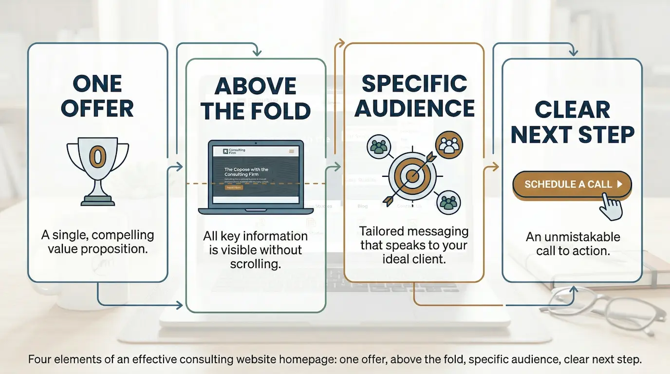
One offer. Above the fold. For a specific audience. With a clear next step.
The goal is to sequence what you do, not hide it.
Think of your homepage as the first minute of a first meeting. You wouldn’t open that meeting by handing the prospect a 40-page capabilities deck and saying, “Take your time.” You’d lead with the most relevant thing. The offer most likely to make them lean forward.
So here’s the structure: one offer, above the fold, for a specific audience, with a clear next step.
One offer. The one you most want to be hired for right now. The one with the best client outcomes. The one you’d choose if a prospect could only hear about one thing.
Above the fold. Visible without scrolling. Before the company history. Before the testimonials. Before anything else.
For a specific audience. Not “mid-market businesses.” The specific type of firm you do your best work for and want more of.
One clear next step. Not three competing options. One.
How to fix your consulting firm’s website homepage
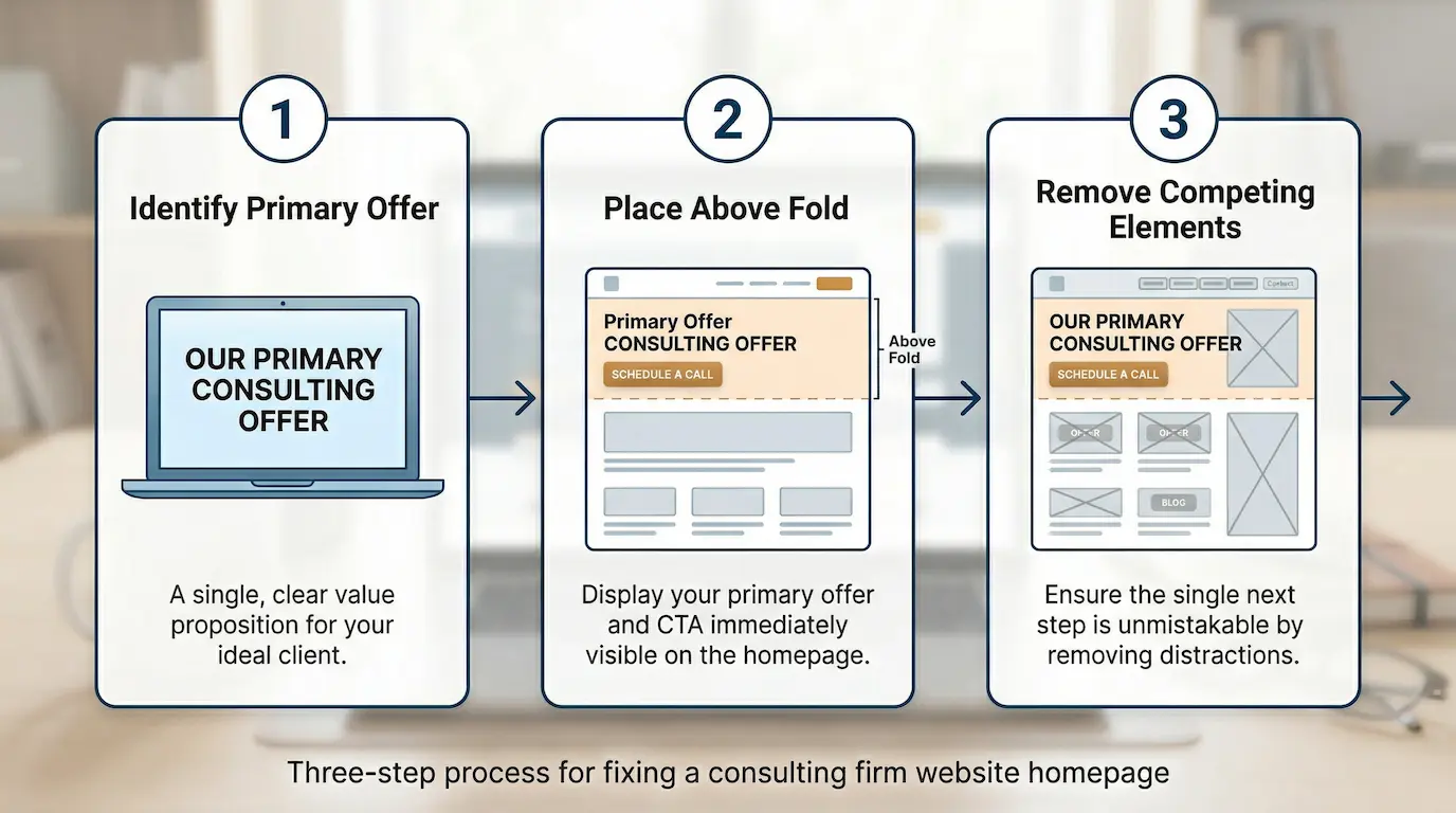
Step 1: Identify your one primary offer
This is usually the hardest step because it requires making a real choice. Picking one thing to lead with means temporarily deprioritizing others. Most firms resist this. They worry about turning people away.
I get it. But the moment you commit to one primary offer, your entire homepage gets easier to write. The headline becomes clear. The call to action becomes obvious. The supporting copy has a job.
Without this decision, every sentence tries to serve too many purposes at once. You end up with copy that says a lot without communicating anything.
Ask yourself four questions:
- What’s the one service I most want to be hired for right now?
- What do my best clients hire me for? The work that produces the best outcomes?
- Where do I have the clearest positioning? Where would a prospect immediately think “this is exactly what I need”?
- Which offer has the best margins and the highest client satisfaction?
Where those answers overlap, that’s your primary offer.
Here’s what the difference looks like in practice:
What not to do: “We offer strategic consulting, operational improvement, financial analysis, M&A advisory, leadership coaching, and training programs for mid-size firms across healthcare, manufacturing, and professional services.”
What works: “We help healthcare consultancies land better clients by fixing the messaging that’s costing them referrals. One engagement. Measurable results.”
The second version tells me exactly who it’s for, what it does, and what to expect. The first tells me you do everything, which means you’re the expert in nothing.
One more thing: don’t confuse “we offer many services” with “we can’t lead with one.” Every well-positioned firm offers multiple services. They just don’t lead with all of them at once.
Step 2: Put your best offer where visitors look first
Research on how people use websites is pretty consistent: they read the top and skim (or leave) everything below. Your most important message needs to be above the fold, visible before a single scroll.
This is about decision-making psychology, not design. Visitors make a judgment about whether they’re in the right place before they’ve scrolled an inch. If your primary offer isn’t visible in those first seconds, many visitors will never see it.
Your above-the-fold section should have four things:
- A headline that states what you do and who you do it for
- A subheadline that names a specific outcome or explains your approach
- A brief proof point, one line, something concrete
- One call to action
That’s it. Everything else goes below.
What not to do: A homepage that opens with a welcome message, the firm’s founding year, a mission statement, and a client testimonial, before ever mentioning what the firm actually does or who it’s for.
What works: A headline that leads with a specific outcome – “We help $1M–$5M consulting firms turn referrals into a predictable pipeline, without hiring a marketing team” – followed immediately by one button: “See How It Works.”
Visitors decide in seconds whether they’re in the right place. Make those seconds count.
Don’t confuse “things that matter to us” with “things that matter to visitors.” Founding year, awards, certifications, and mission statements matter to you. They don’t help a visitor decide whether to stay.
Step 3: Remove everything that competes with your primary message
Every additional option on your homepage is a fork in the road. More forks mean more chances for someone to take a wrong turn, or stop walking altogether.
This is about sequencing what you offer. When someone first lands on your site, they’re in discovery mode. Give them one clear thing to discover. Once they’ve decided you’re relevant, they’ll look for more.
The mistake is presenting the full catalog before establishing relevance.
Do a homepage audit. List everything on your page:
- Navigation links
- Calls to action
- Service descriptions or categories
- Content sections (blog feed, news, awards, team bios)
For each item, ask: does this help my primary offer, or does it compete with it?
If it competes, move it. A services page, an about page, a resources section are all fine. Just not on the homepage before you’ve established relevance.
What not to do: A homepage with six navigation links, three different calls to action (Book a Call / Download Our Guide / Watch the Webinar), and a blog feed taking up the bottom third of the page.
What works: A homepage with one clear headline, a brief subheadline, a single proof point, and one call to action. Navigation still exists for people who want to explore, but the homepage focuses attention on one thing.
A comprehensive homepage tells visitors everything about you. A persuasive one tells them the one thing most likely to make them take the next step. Those are different jobs, and your homepage only has time for one of them.
Common questions about homepage clarity
“But what if visitors want to see all my services?”
They will. Eventually. But not before they’ve decided you’re relevant. Once a visitor is convinced they’re in the right place, they’ll go looking for the services page. Give them a reason to look.
“Won’t a focused homepage make us look smaller or less capable?”
Usually the opposite. A focused homepage looks like an expert. A scattered one looks like a firm still figuring out its positioning. Specialists charge more than generalists. Focus signals confidence.
“What about clients who come to us for other services?”
Put those services on a services page and link to it from navigation. Visitors who want to explore will explore. The homepage is for new visitors making a quick relevance decision, not for every possible scenario.
“Our business is complex. Can we really capture it in one message?”
Every complex business has a highest-value offer. The complexity doesn’t go away. It gets communicated after a prospect has decided to engage. Leading with complexity on the homepage is like answering “what do you do?” with a 20-minute capabilities presentation. It misses the moment.
“What if we have two equally strong offers?”
You can mention two. But you can only have one primary. The moment a visitor has to choose between two equally emphasized options, they’re making a decision you should have made for them. Pick the one most likely to connect with the majority of your ideal clients.
How one firm fixed its homepage
A 5-person management consulting firm came to me with a familiar problem. They offered strategic planning, operational improvement, change management, and executive coaching across three industries. Their homepage reflected all of it: eight navigation links, four service descriptions, two competing calls to action.
Visitors were landing, looking around, and leaving. Analytics showed an average time on page under 90 seconds and a bounce rate over 70%.
We started with one question: what’s the one service you most want to be hired for?
After some internal debate, the answer was clear. Their change management work had the best client outcomes. It’s also what people referred them for the most. But on the homepage, it was item four under the Services dropdown.
Easy fix. We rewrote the headline to lead with change management. Moved everything else below the fold. Replaced two calls to action with one.
Three months later, average time on page was over three minutes. Bounce rate dropped to 52%. Qualified inquiries from the homepage went from 2 per quarter to 7.
The services didn’t change. The positioning didn’t change. The order changed.
What to do next
Your homepage isn’t a menu. It’s a first impression, delivered in a few seconds, to someone who hasn’t decided anything yet.
The Cheesecake Factory gets away with 250 options because people arrive already knowing they want a meal. Your website visitors haven’t decided whether to stay. That’s a different job.
Here’s what matters:
- Too many homepage choices don’t help visitors decide. They prevent it
- Your best offer deserves the top of the page, not a submenu
- Above the fold is your most valuable real estate. Use it for your primary offer
- One call to action converts better than three competing ones
- Focus means sequencing what you offer, not hiding it
Open your homepage right now. Look at what a first-time visitor sees before they scroll. Is your best offer there? Is it clear who it’s for? Is there one obvious next step?
If you can’t answer yes to all three, you know where to start.
Want more insights like this?
Subscribe to The Business Builder, my weekly newsletter for boutique B2B and professional service firm founders who want better messaging, more consistent leads, and stronger positioning.
Every week: practical frameworks and steps you can use right away. No fluff, no generic advice.